
Challenge
The challenge emerged from both personal observation and real user struggle with existing public legal aid services. In Taiwan, free legal assistance is typically provided through government channels, but it is buried deep in navigation and lacks clear pathways, causing confusion and preventing users—especially those with limited experience—from accessing help when they need it most.

My Role
This project was done individually. I planned and directed the whole thing, including UX research and UI design.
The Goal
The goal is to design a dedicated, responsive platform that prioritizes key user needs, simplifies existing task flows, and makes legal self-help accessible and easy to use for all users.
To empathize the user
User Research
I conducted interviews with current visitors and reviewed the statistical data from legal organizations. The report showed that nearly 40% of applicants come from marginalized groups, including people with disabilities, new immigrants, and Indigenous communities. These users often face higher barriers when accessing legal support. In addition, with society moving toward a super-aged structure—where over 20% of the population is elderly—older adults must also be considered as a key user group.
Two types of users were identified :
- Immigrants who are not familiar with public resources
- Elderly persons with basic digital literacy and facing visual and comprehension challenges
Users consistently focused on completing a few high-priority tasks:
- Consulting a lawyer about their legal concerns
- Obtaining trustworthy resources in a cost-effective way
- Looking up reliable information related to their situation
Paint Points
-
Usability Issues
The interface is cluttered with irrelevant content and key functions are hidden in a long list menu.
-
Lack of clear guidance
Lack of clear instructions on what services are provided and where to start and follow through.
-
Complex Terminology
Complex jargon is used instead of plain language, which makes the content feel inaccessible.
-
Appointment Barriers
Some topics are only available on certain weekdays and at specific offices, which makes scheduling an appointment more difficult.
Persona

"I'm new as a business owner, and the legal issues often completely baffle me."
— Gerald, a 26-year-old second-generation immigrant and shop owner who barely accesses public services.

Goals
- Find relevant legal information that applies to his situation
- Access reliable resources to support decision-making
Frustrations
“The site is packed with reports, it's a real pain trying to go through all of it.”
”There’s too much red tape to find what I need.”
“I’m not sure which information actually applies to my case.”
Bio
Gerald has a Vietnamese and Taiwanese background. He started his business as a franchisee. He juggles long working hours and financial pressure. He feels uncertain about the contract terms that limit his profits. He’s looking for clear legal information to better understand his rights and options.

"Being a life-long learner makes me feel active. I'm confident that I can handle my daily activities well."
— Martin, a 74-year-old elderly individual with limited digital literacy and visual impairment.

Goals
- Understand legal information without feeling rushed or confused
- Complete tasks at his own pace with clear guidance
- Feel confident making decisions on his own
Frustrations
“They seem too complicated, I get worried about pressing the wrong button.”
”There’s too much on the screen, and the text is hard to read.”
“I don’t know where to begin.”
Bio
Martin has been retired for 15 years and lives in a rural area. He is farsighted and needs to wear glasses to read. He has been keeping a dog and walks the dog every day. One day his dog hit by a scooter and got hurt.
Martin would appreciate a legal service that can help him settle the dispute or take legal action without involving outsiders.

User Journey Map
-

Discovering the Website
- Search online for legal aid resources
- Key services are hard to find -

Fill out Forms
- Provide personal and case-related information
- Some form fields are ambiguous -

Scheduling an Appointment
- Select a date, time, and location for consultation
- Confused about availability of certain issue -

Preparing Documents
- Gather necessary papers and organize information
- Unsure which documents are required -

Attending the Consultation
- Meet with legal staff to discuss their case
- Confirmation details are unclear
Low Effort
Feature prioritization
Make an appointment
Referrals to legal organizations
Appointment inquiry
Step-by-step guidance
Accessibility features
General legal knowledge
Introduction of the website
Must Have
Quick action button for phone calls
Share via SMS
Share via email
Print out information
Contact us
Search for topics
2-Step verification
Good to Have
Specific issue appointment
Categorized meeting type
Edit appointment
Online donation
Volunteer recruitment
Educational events
Chat feature
Documents download
5-star rating surveys
High Effort

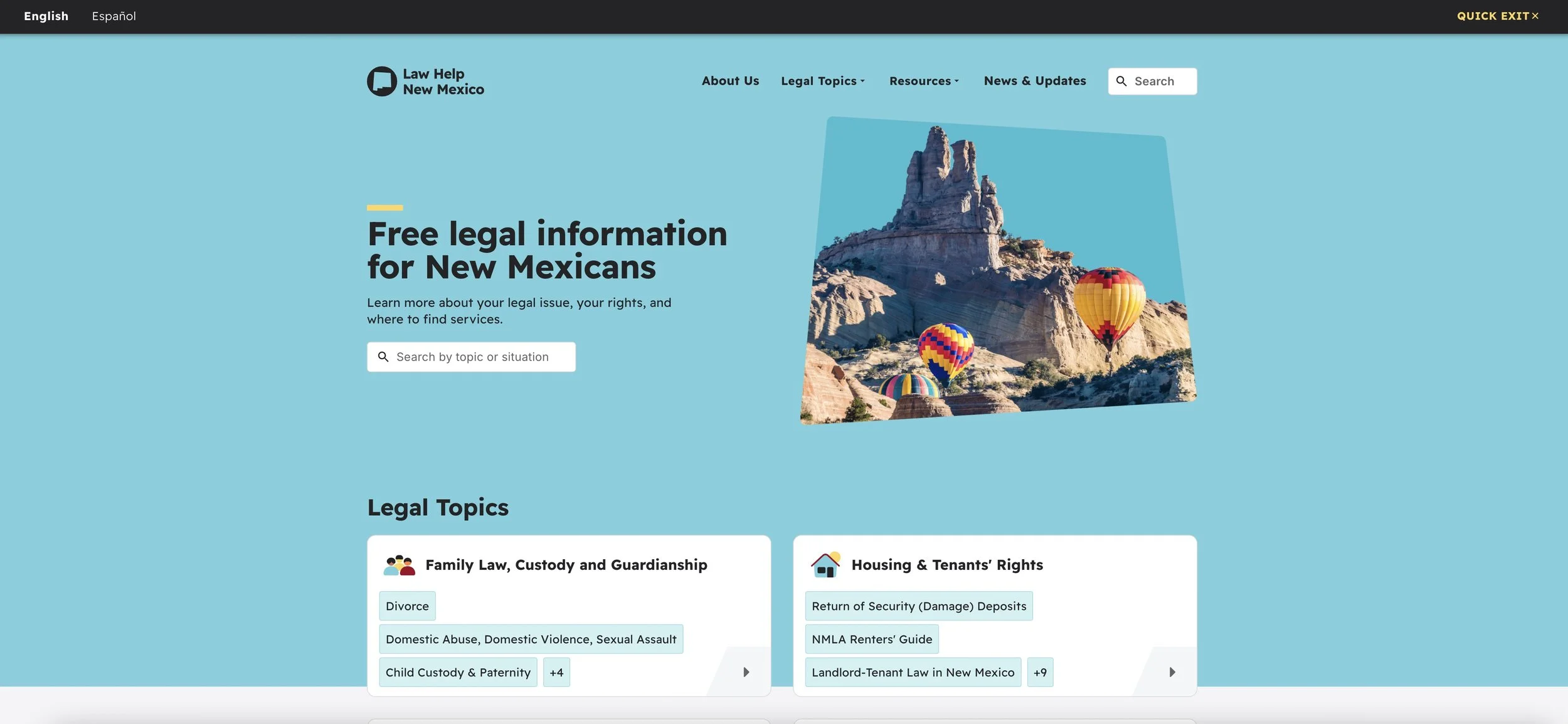
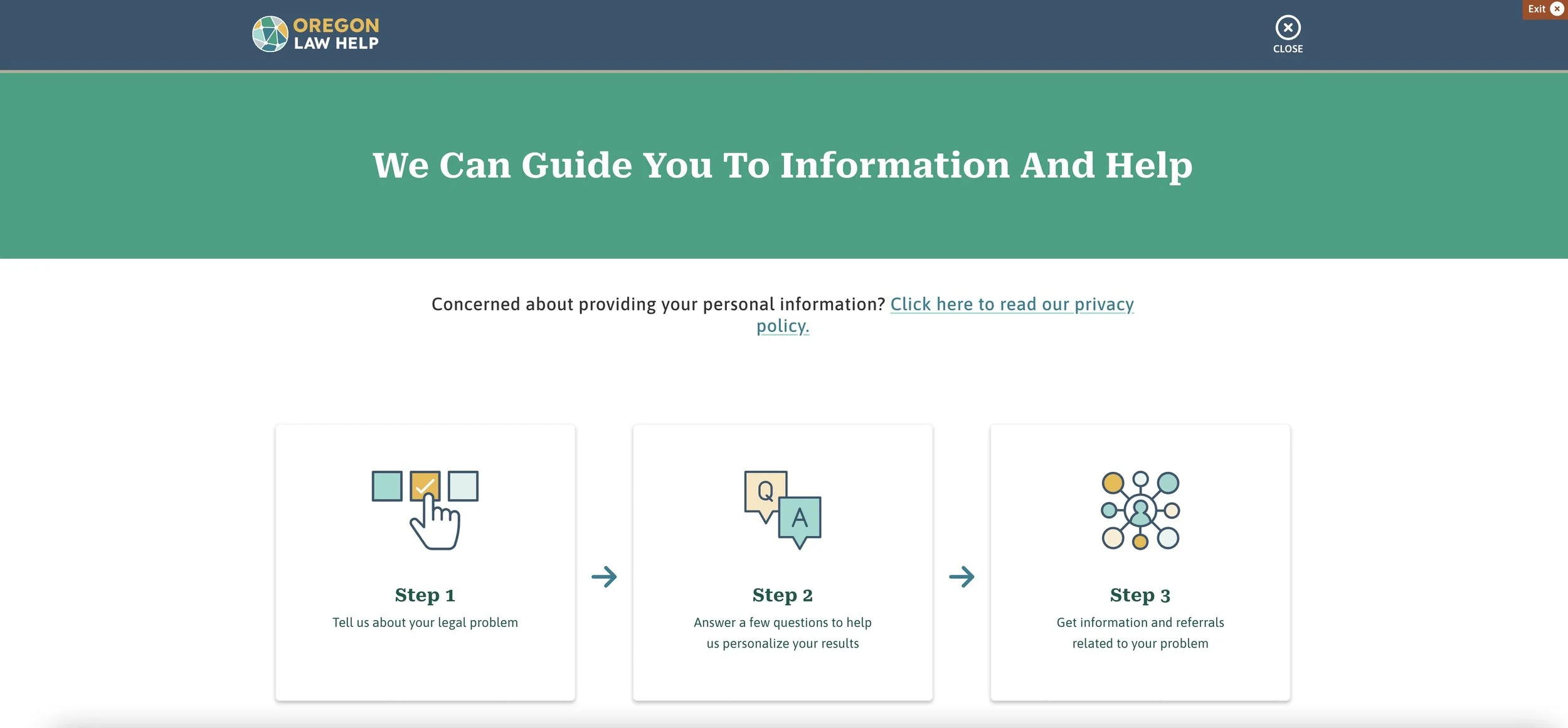
Competitive Analysis
Legal Service
Commission South Australia
Legal Help
New York
Law Help
Oregon
Features

Readable content
Cross-platform consistency
Step-by-step guidance
Accessibility
Well rounded accessibility features
-Large clickable buttons
-High color contrast
-Clear content hierarchy
I compared free legal service websites in the USA and Australia, they offer clearer guidance, topic search, and multilingual support. In contrast, existing local sites focus on appointments scheduling with limited useful resources, revealing opportunities to reshape content structure and task flows. Through Analyzing the functionality and user flow of these websites, I gained valuable findings for the product.
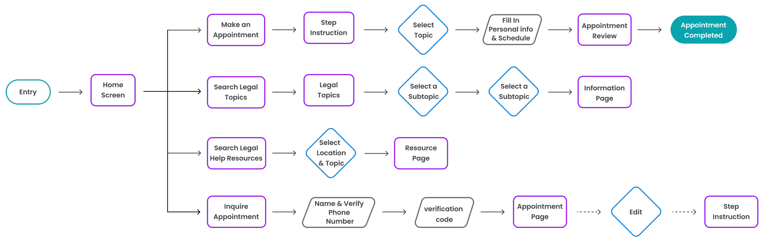
User Flow
Normal
Shallow menu level
Descriptive and friendly guidance
Show related content in the sidebar

2 language modes
Easy to complete tasks
Shallow menu level
Navigation
Normal
Clear menu breakdown
Law Help
Mexico
Focus on key features
2 language modes

User Flow
Make an appointment / Search legal topics & resources / Inquire appointment
I carefully outlined the user's typical paths in four main tasks. The flow emphasizes direct access to high-priority actions and ensures tasks are straightforward and easy to complete.

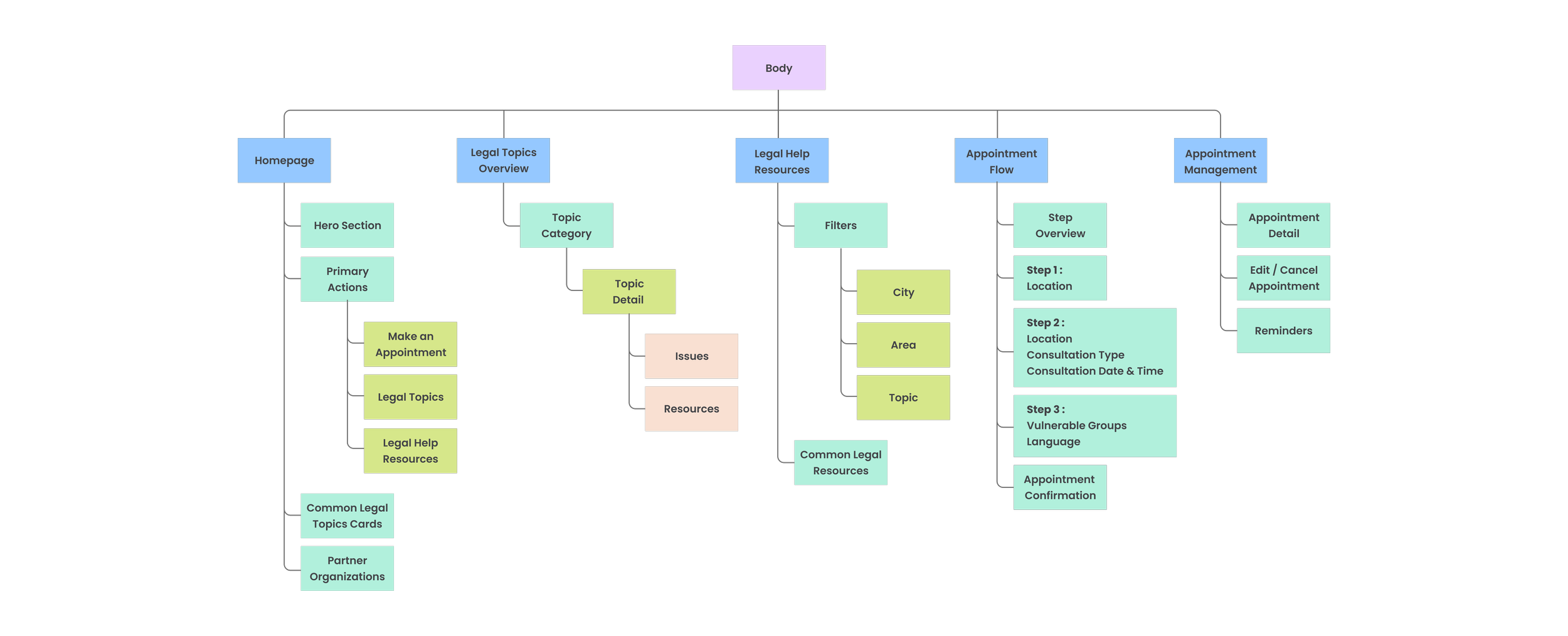
Sitemap
I implemented a task-focused hub structure overall that guarantees users can accomplish their major tasks with minimal depth and distraction. The scheduling process is sequenced to guide users through one task at a time. This will address pain points and offer them effortless navigational experiences.
Body
The body focuses on guiding users toward the right type of legal support with minimal effort. Clear entry points such as making an appointment, browsing legal topics, or accessing resources help reduce confusion and support users in taking the next step with confidence.
Footer
The footer consolidates supporting information such as policies, disclaimers, keeping them accessible without interrupting the primary user journey.

Header
The header is structured around immediate access to help.
Key actions—making an appointment, exploring legal topics, and contacting the helpline—are surfaced early, while utility actions and accessibility tools ensure users can quickly find help in a way that fits their needs.
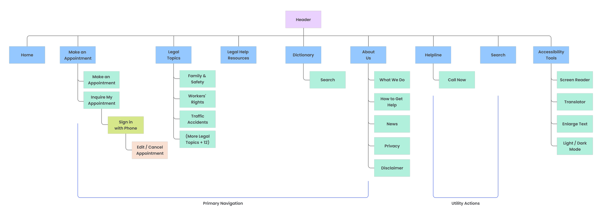

By integrating insights from user research, I prioritized three key features for the mobile version. Placing these features at the top ensures that users are directed to take their desired action first, with limited sub-categories below for effortless navigation.
Additionally, I strategically placed accessibility tools below the header and included a phone call button for immediate assistance.
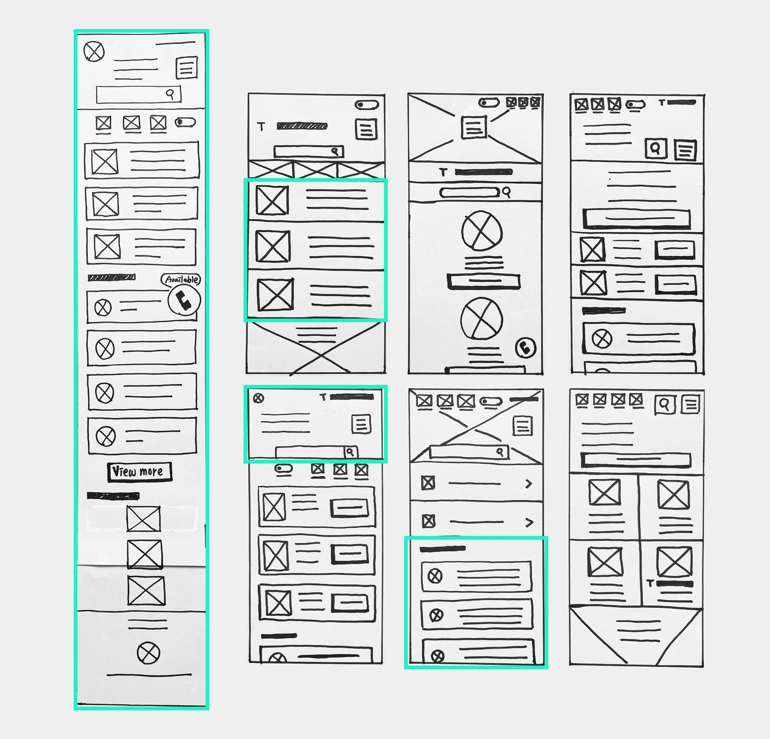
Paper Wireframe

Initial UI design and Wireframe
Early wireframes focused on the three primary user goals—making an appointment, finding legal information, and accessing resources. Labels and buttons were simplified to reduce cognitive load and support quick scanning.
Home Screen

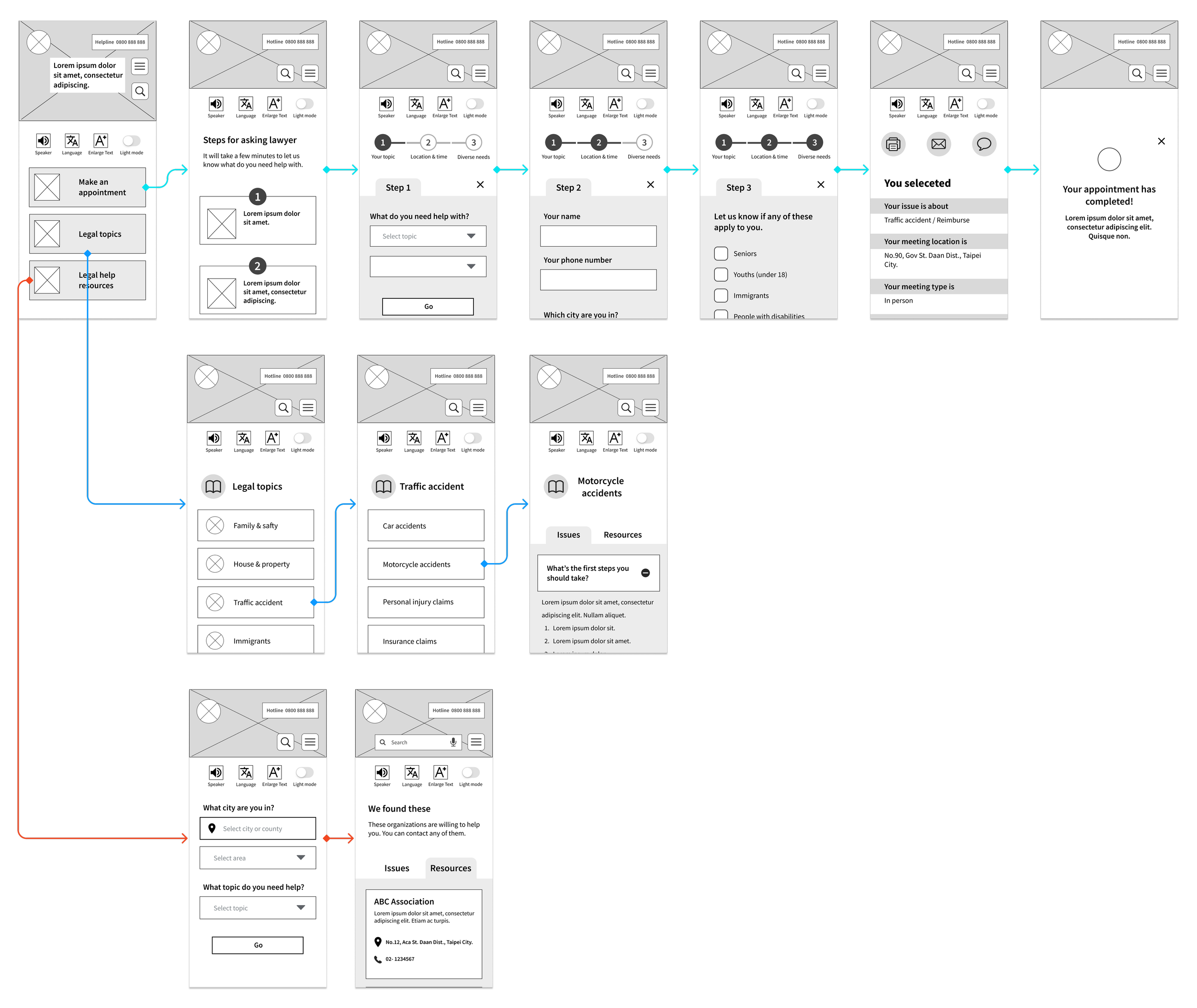
Lo Fidelity Prototype
The low-fidelity prototype demonstrated core task flows with clear step-by-step guidance, helping validate navigation and task completion before visual refinement.
To Understand the user
Usibility Study
Parameters
Study Type
Unmoderated usability study
Participants
Number : 5
Age : 21-75 years old
Location: Taipei
Length
15-20 minutes/Per
This study aims to uncover the specific challenges users encounter when completing core tasks on different devices. By tracking time spent, conversion rates, and identifying areas of difficulty, I can make informed design improvements.
Participants were asked to complete two tasks :
- Making an appointment
- inquiring about the appointment
The findings from this study will be crucial in enhancing the final design.
Findings
-
Label Naming
Users found the wording "schedule" on the schedule page confusing and were unsure if it was clickable.
-
Calendar Layout
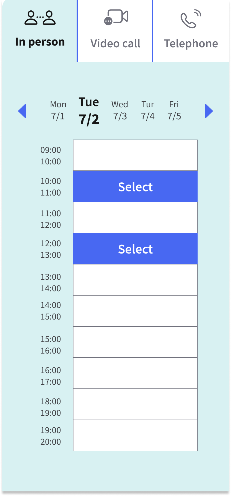
In the mobile version, the schedule table only showed one date, making it difficult for users to choose from other days.
-
Inquiry Results
Users also wanted a clearer confirmation that their appointment was successfully scheduled on the inquiry page.

Design Iteration
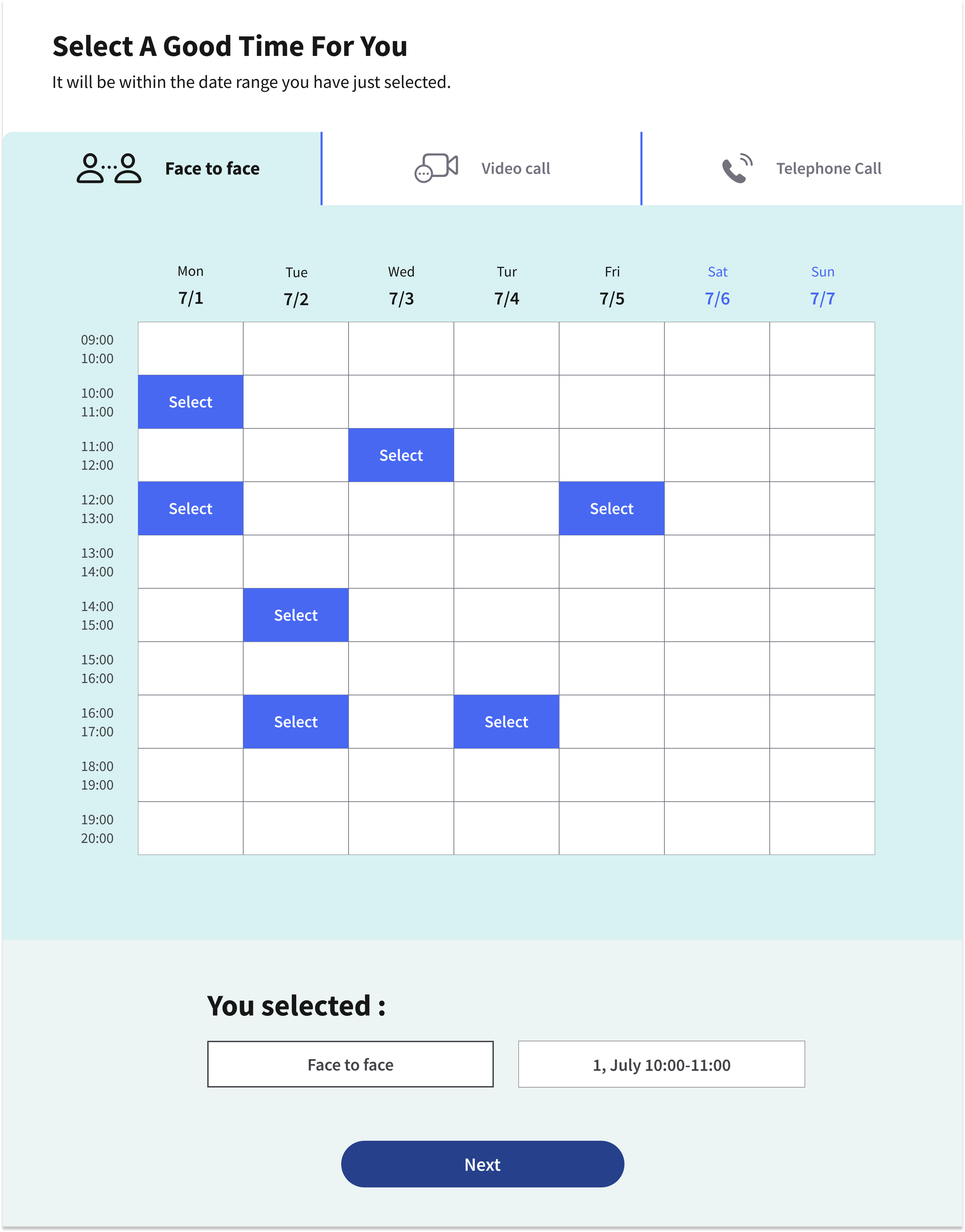
The button label was updated from “Schedule” to “Select” to better match users’ expectations and clarify the action.
On mobile, the date section was highlighted available time slots and removed less relevant information.
After completing an appointment, users can access to the appointment details page with a brief greeting, allowing users to confirm and feel reassured about their booking.


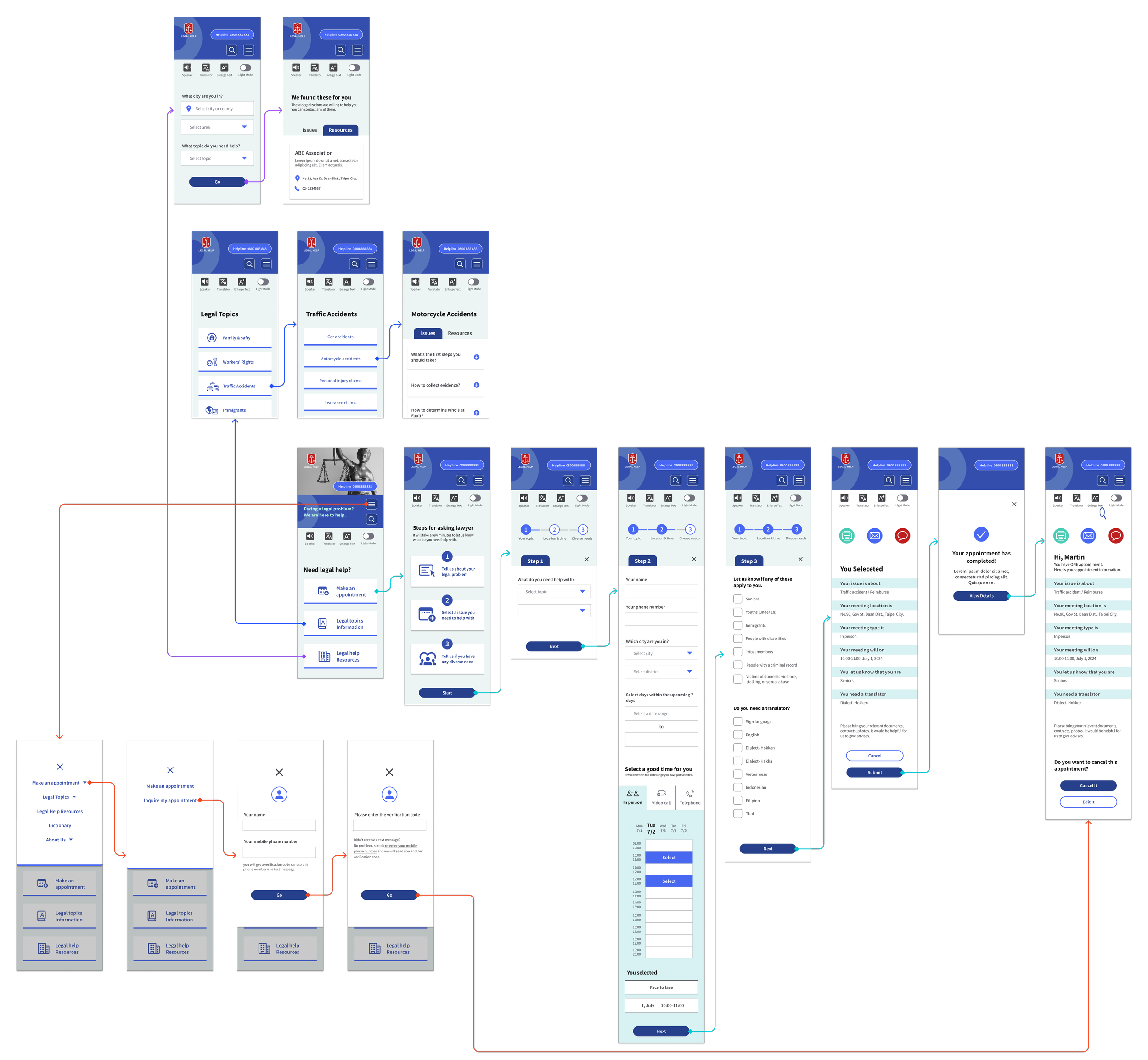
Hi Fedility Screen Flow
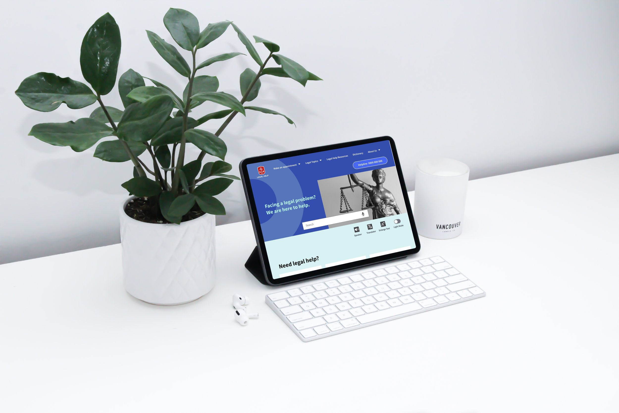
Check out the latest design! Every screen is optimized to provide immediate clarity, minimized psychological hurdles and interaction friction. Visual choices support quick scanning, especially for users with limited digital experience. I chose a blue color scheme to convey professionalism and trustworthiness, while the vibrant red logo symbolizes positivity.
Home Screen
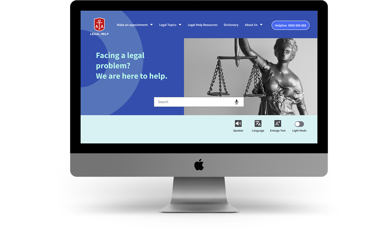


Hi Fidelity Prototype
Make an Appointment
Provided clear and step-by-step booking flow with large, easily tappable buttons and simple forms, make it a breeze to complete the process, especially on mobile.
Search for Legal Information
Legal topics are organized into categories, and presented it in a friendly Q&A format with plain language, make it more approachable for all users.
Search for Legal
Resources
Users can find legal aid organizations by issue type and location, with concise contact details and simple action points that reduce hesitation and help users take the next step.
Inquire About an Appointment
The appointment inquiry flow includes 2-step verification, while providing straightforward options to view, edit, or share booking details via email or SMS.
Accessibility Tools
Accessibility features like screen reader, translation, text enlargement, and light mode are consistently available, ensuring users with varying needs can engage comfortably throughout the experience.

Closing Thoughts
Takeaways
This project began as a requirement of my course - to design a social-good solution. Legal matters can be complex and stressful for many people. Through reviewing existing platforms, I identified gaps in clarity, reassurance, and accessibility.
I learned that small design choices—such as wording and confirmation feedback—can greatly influence users’ confidence in stressful situations. Designing for overlooked users required going beyond surface usability and understanding what truly prevented them from seeking help. Inclusive and accessible design is not an extra layer, but a core responsibility, and thoughtful UX can help reduce real barriers to accessing legal support.
Next Steps
- Accessibility Testing & Interviews
Conduct targeted accessibility testing and interviews with key
demographics (immigrants, elderly) to validate assumptions and
uncover deeper insights.
- Content Strategy
Add downloadable support resources—to help users take the
next step with confidence.
- Visual Design Iteration
Exploring ways to incorporate user-friendly design elements, such
as icons or illustrations to improve engagement and usability.