

The Problem
Sending flowers is often tied to specific dates and occasions, yet most flower gifting websites focus primarily on product browsing rather than planning or timing.
In the initial version of the product, the focus was on improving basic usability and adding calendar reminders to help users remember important gifting occasions. The experience treated reminders and purchasing as separate actions, requiring users to manually search from scratch. This disconnect created friction in what should be a thoughtful and time-sensitive gifting experience.

My Role
This project was done individually. I planned and directed the whole thing, including UX research and UI design.
The Goal
The initial goal was to design a flower gifting website that integrates calendar reminders, helping users remember important occasions and never miss a pre-order window.
The focus was on improving usability around reminders and simplifying the purchase flow, ensuring users could act on those reminders with minimal effort.
Persona

“I try to keep track of all the important dates, but my schedule is crazy, so I need it simple and reliable.”
— Marco, a 43-year-old doctor juggling a hectic schedule

Goals
- Remember important dates without extra effort
- Be reminded at the right time to take action
- Complete gift-giving smoothly and without stress
Frustrations
“I’m usually juggling too many things to remember every important date.”
“I want to do the right thing, just without overthinking it.”
Bio
Marco is a doctor at a mid-sized hospital with a busy and unpredictable schedule. He values his relationships with his family, friends, and key clients, but doesn’t always have the time to plan ahead. He appreciates tools that help him remember important moments and allow him to take action efficiently without disrupting his routine.

“I like taking my time picking gifts and making sure they look just right.“
— Cathy, a 29-year-old, education professional who cares about thoughtful gifts
Goals
- Feel confident about what she’s purchasing
- Clearly understand what the final gift will look like
- Make a decision without second-guessing afterward
Frustrations
“I want to feel sure before I hit the buy button.”
“I don’t want to guess how the final result will turn out.”
Bio
Cathy is an education professional with 6 years of teaching experience who lives on the outskirts of Taipei. She is thoughtful and selective when choosing gifts. She values aesthetics and presentation, and believes that how a gift looks is just as important as the gesture itself.
She prefers to take her time exploring options before making a decision.

User Journey Map
-

Walk into the store
- Enters the flower shop with a general occasion in mind
- Relies on the space and staff to guide the next step -
Express needs to the clerk
- Describes the occasion, budget, and rough preferences
- Feels relieved not having to decide everything alone -

Wait for arrangement
- Observes flowers being selected and wrapped
- Gains confidence by seeing the bouquet take shape -

Write a card
- Takes a moment to think about what to say
- Feels emotionally connected to the gift -

Make payment
- Completes the purchase under time pressure
- Leaves feeling the task is properly taken care of

Competitive Analysis
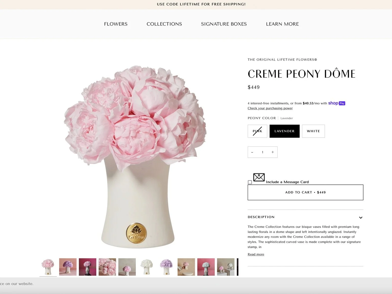
Ribbon
Arena
La Fleur
Pre-order
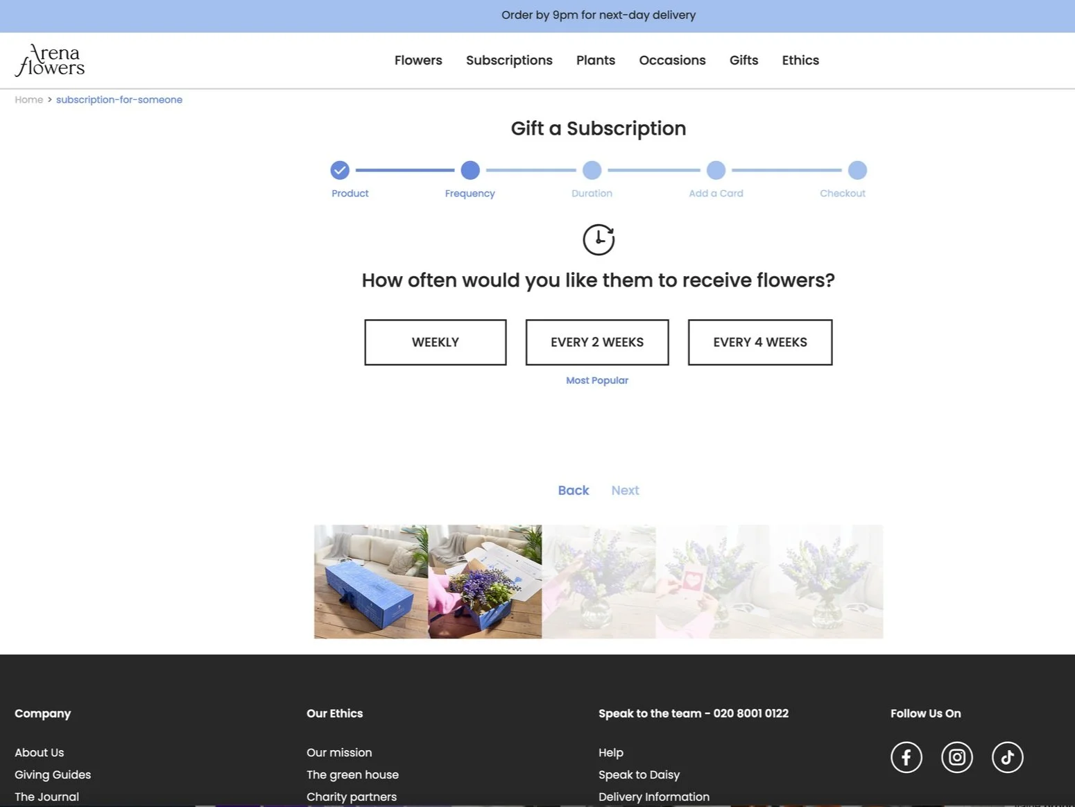
Only regular subscription
Only regularly subscription
None
Product Detail
Single option on the page
Single option
I reviewed several existing online flower delivery platforms to understand common patterns and limitations. While some platforms offer useful features such as product ratings and reviews, they generally lack support for advance planning. Key gaps include limited pre-order flexibility, consideration of time-based gifting needs, and checkout flows that require users to repeatedly enter information.
Checkout Info
Save payment
Save recipient
None
Rewarding program
Product rating

Color option
Save payment
Good to Have
Attached card
9 language modes
Value Proposition
-
Timely Gifting Support
- Help users remember important occasions with reminders
- Reduce the risk of missed dates -
Simple Purchase Flow
- Make ordering quick once a decision is made
- Narrow choices and remove unnecessary steps -
Toward Better Planning
- Begin linking reminders to gifting moments
- Reduce the gap between remembering and taking action -
Clear Choices
- Support thoughtful decision-making
- Reduce uncertainty when choosing a gift

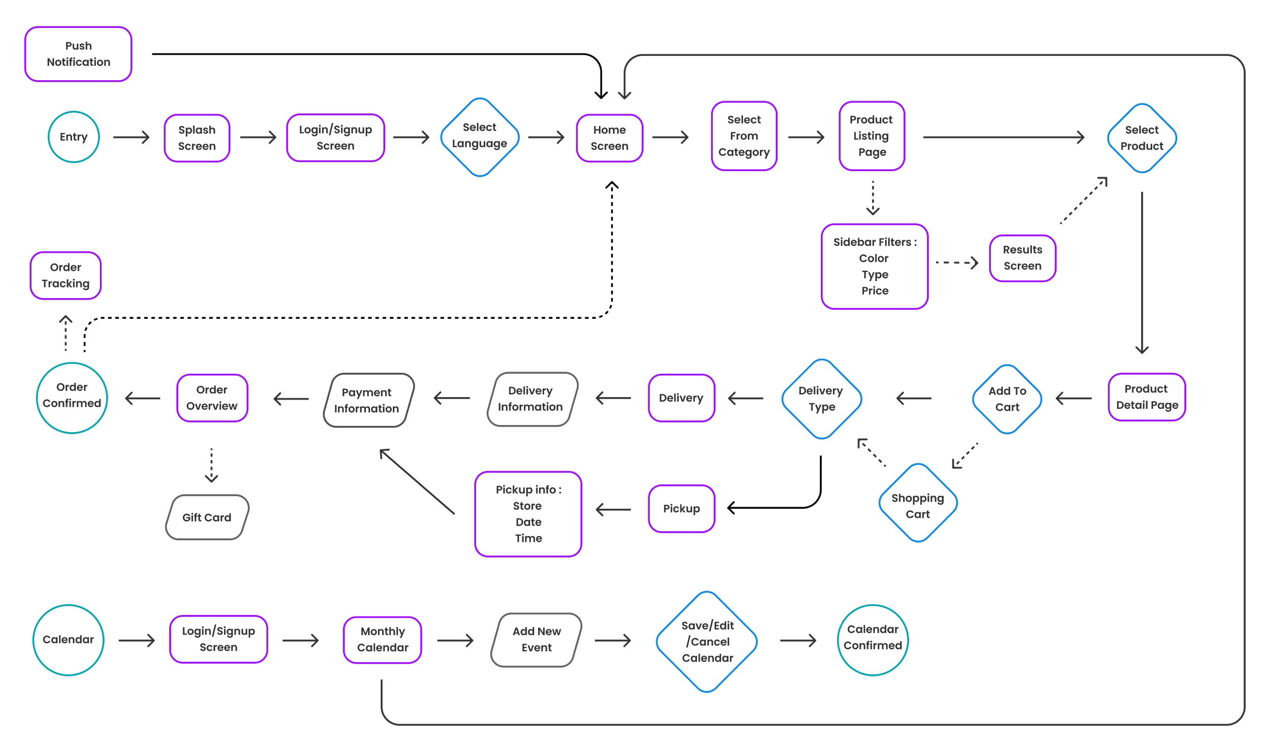
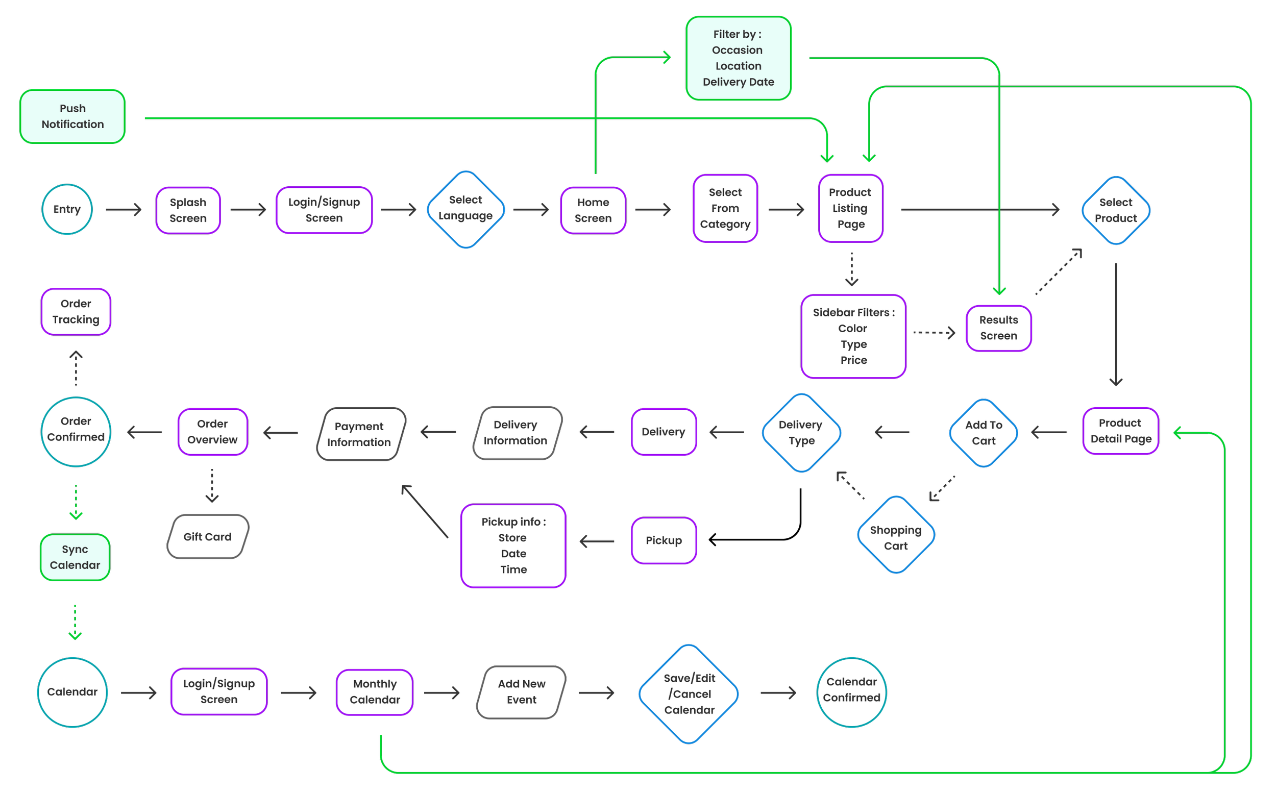
User Flow
Browsing / Checkout / Add a new event
I mapped out the end-to-end user flow across browsing, purchasing, and scheduling, including how users re-enter the experience through notifications and calendar reminders, ensuring that the process is clear and directly addresses their needs. I was also identify where users might lose context or repeat decisions, that will be refined in a later phrase.

Sitemap
The initial sitemap followed a typical category-based structure, with the homepage focused on showcasing different product types. Users were expected to browse, compare, and gradually narrow down their choices. The calendar feature functioned mainly as a reminder tool, operating separately from the shopping flow. This structure was familiar and easy to understand.
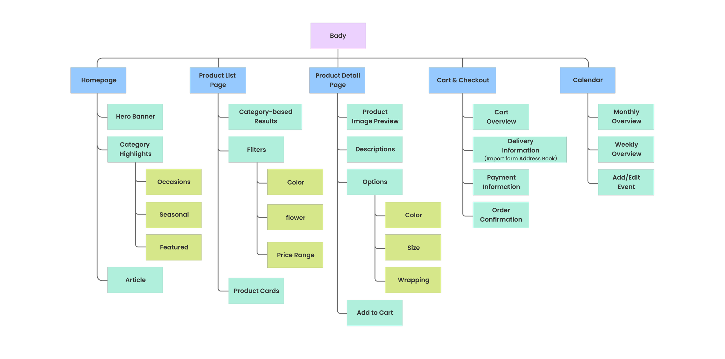
Body
The body focused on category-based browsing, encouraging users to explore products before making a decision. The calendar acted as a standalone reminder and was not directly connected to curated product page in this stage.
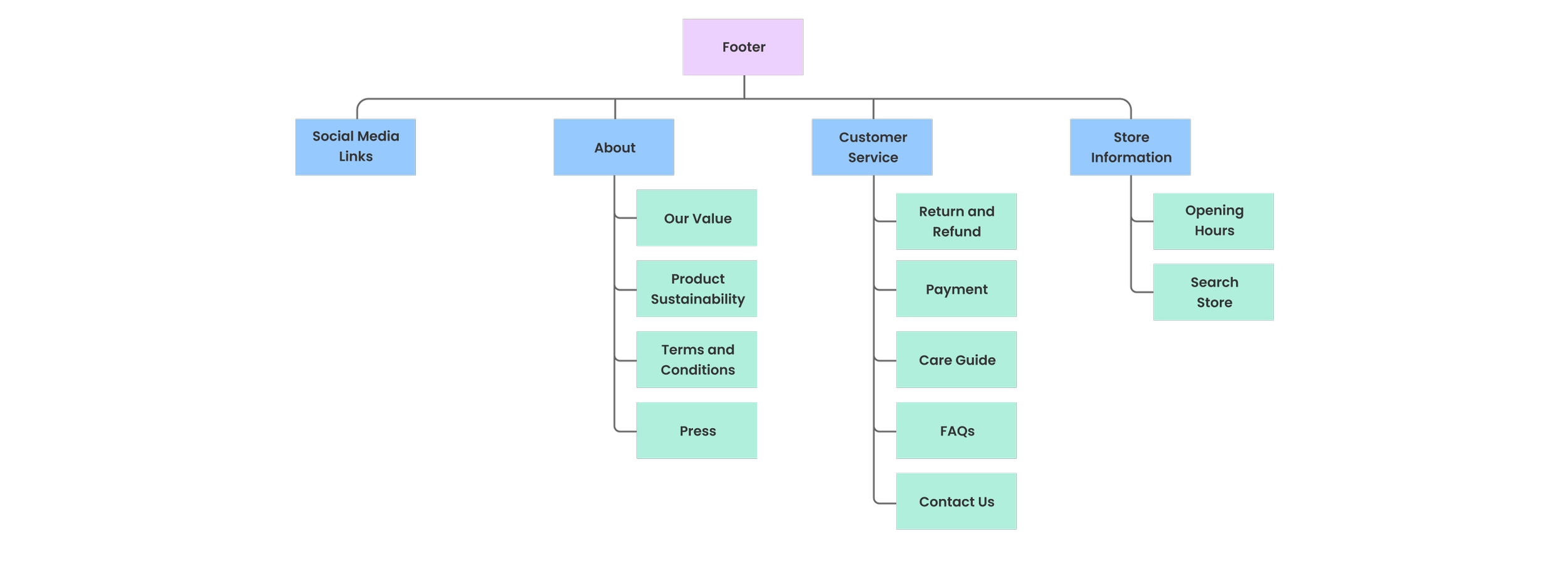
Footer
The footer contained essential informational links supporting users after they had explored or completed a purchase.
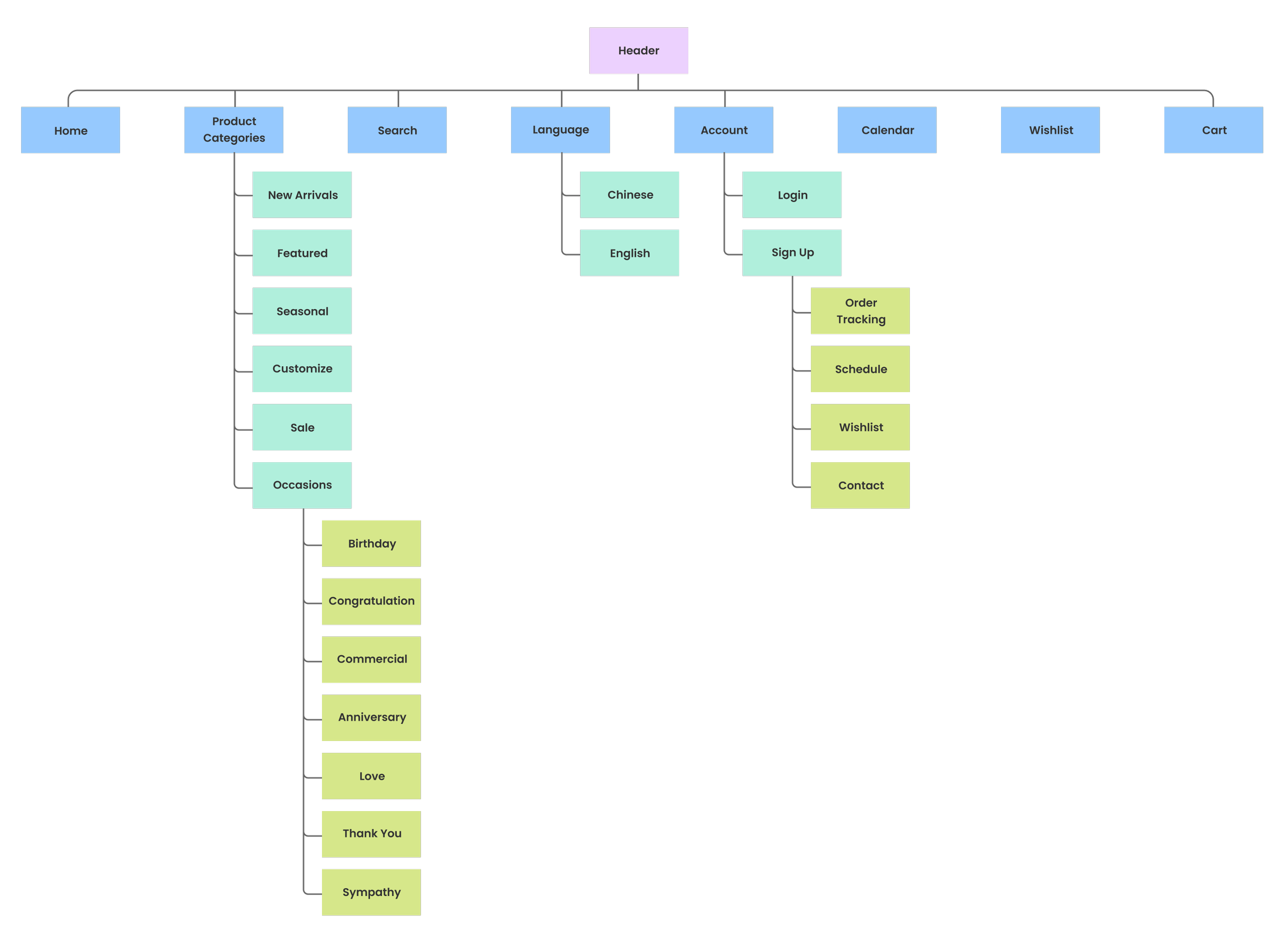
Header
The header provided standard navigation access to product categories, the calendar, and the shopping cart, allowing users to explore the site through familiar entry points.

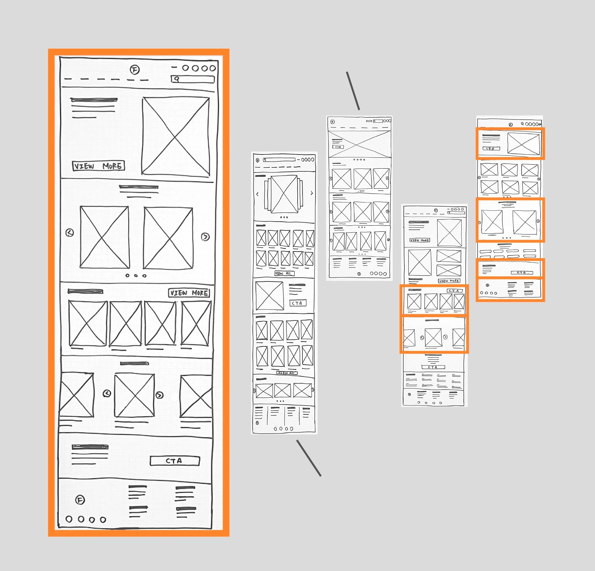
At this stage, I focused on the homepage to explore how product visuals could guide users through different categories. By experimenting with varied layouts, I aimed to make browsing feel engaging rather than repetitive.
This approach allowed me to test how visual hierarchy and layout variations could help users distinguish categories while encouraging further exploration.
Too Simple!
Too complicated!
Paper Wireframe

Initial UI design and Wireframe
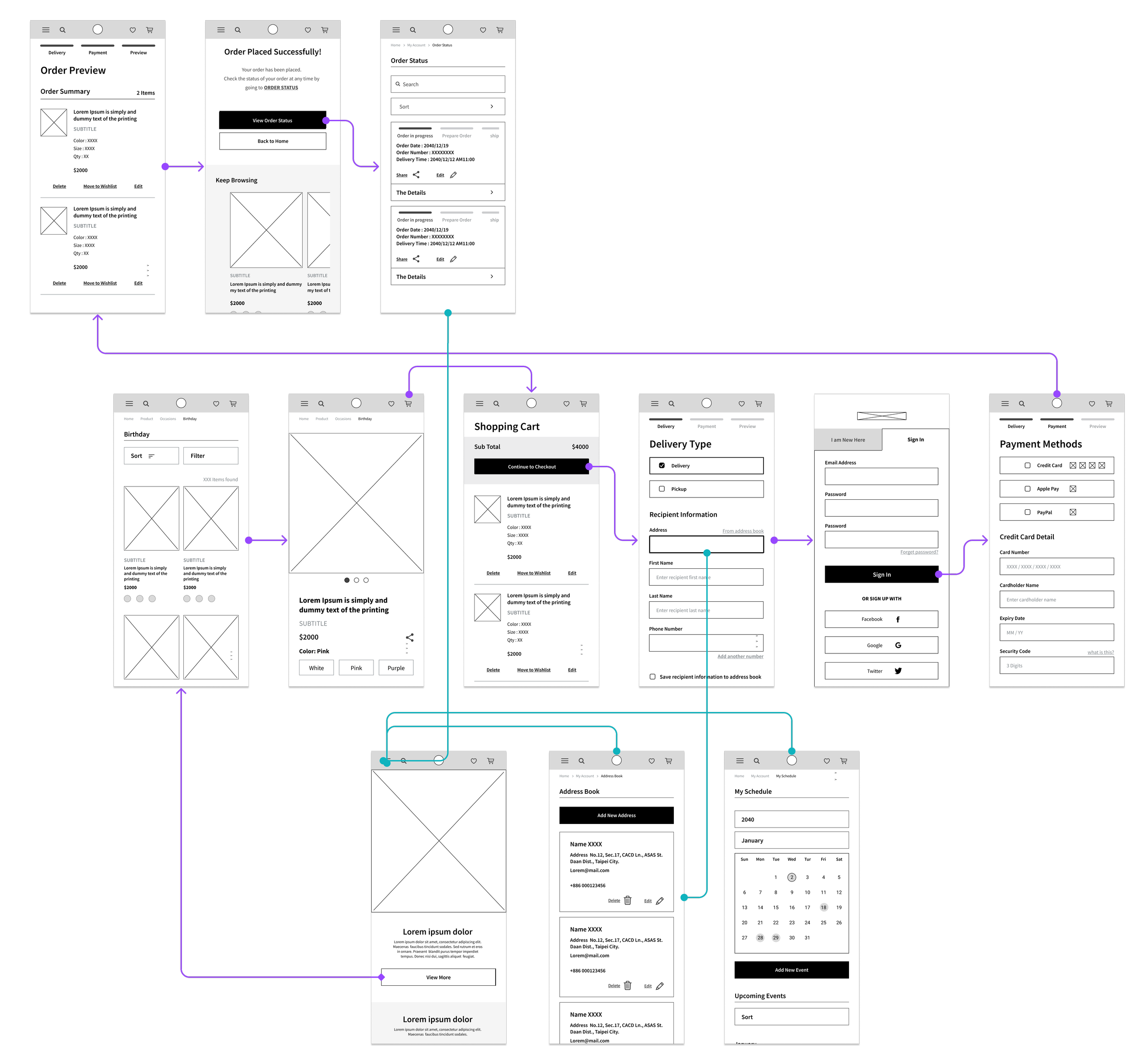
Based on the homepage wireframe, I mapped out the interaction flow between key screens to ensure users could navigate smoothly through browsing to checkout. The flow focused on validating basic usability. At this stage, the goal was to establish a clear and predictable structure before exploring more advanced experience-level improvements.
Here we go!
Home Screen

Lo Fidelity Prototype
The low-fidelity prototype demonstrates how users move between key screens through simple interactions. It was used to validate navigation flow, layout clarity, and core actions before refining visual details
To Understand the user
Usibility Study
Parameters
Study Type
Moderated usability study
Participants
Number : 5
Age : 21-50 years old working professionals
Location: Taipei
Frequency : Buy flowers at least 4 times in a year
Length
20-30 minutes in total/Per
I conducted a usability study to evaluate the clarity and usability of the initial interface, focusing on how users browsed products and completed a purchase within a category-based structure and a basic calendar reminder feature.
For this, I logged time spent, conversion rates, and identified where users were getting stuck. Participants are required to complete two tasks:
- Browse products and complete checkout
- Add a new event to the schedule
Observing user behavior during the two tasks helped identify areas where navigation, layout, and information hierarchy could be improved before moving into further design refinement.
Insights
-
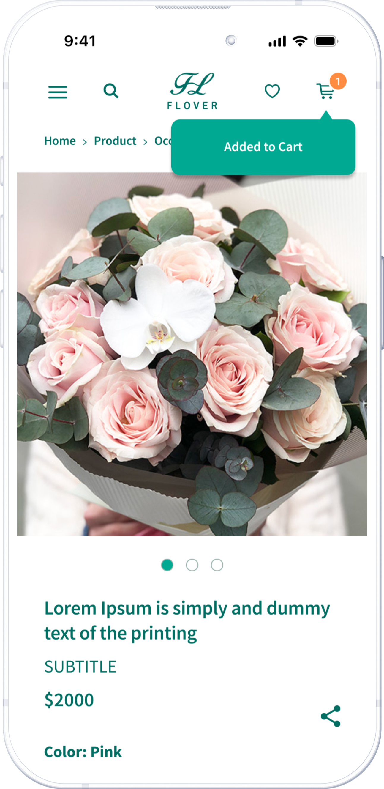
Adding Items to Cart
Many users missed the shopping cart icon at the top and weren't sure if they had successfully added an item. After clicking “add to cart,” providing clear feedback is important.
-
Adding New Events
Users often click on a date in the calendar to add a new event instead of using the "add new event" button. Allowing multiple ways to add a new event is important.
-
Search Results
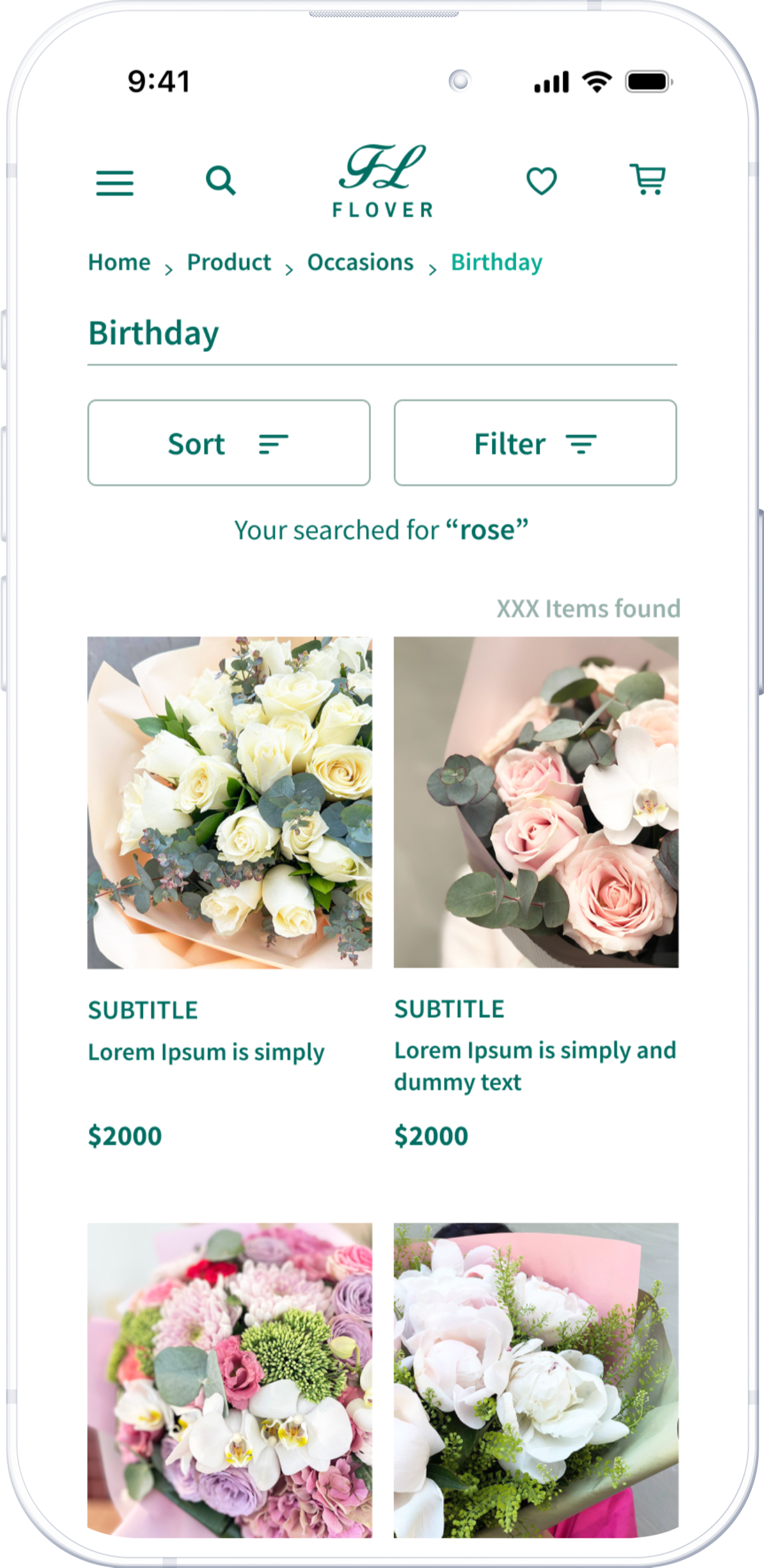
The search results page should retain the initial text to make it easy to edit.

Design Iteration
The product page displays a popup notification immediately after the user adds an item to the shopping cart.
The results page clearly presents the initial request at the top.
Hi Fedility Screen Flow
The final design showcased the main user flow from browsing to checkout in a more polished and coherent interface. It also displayed order status and other features exclusively for logged-in users. The primary color scheme comprised green and earth tones, evoking a natural and plant-related aesthetic.
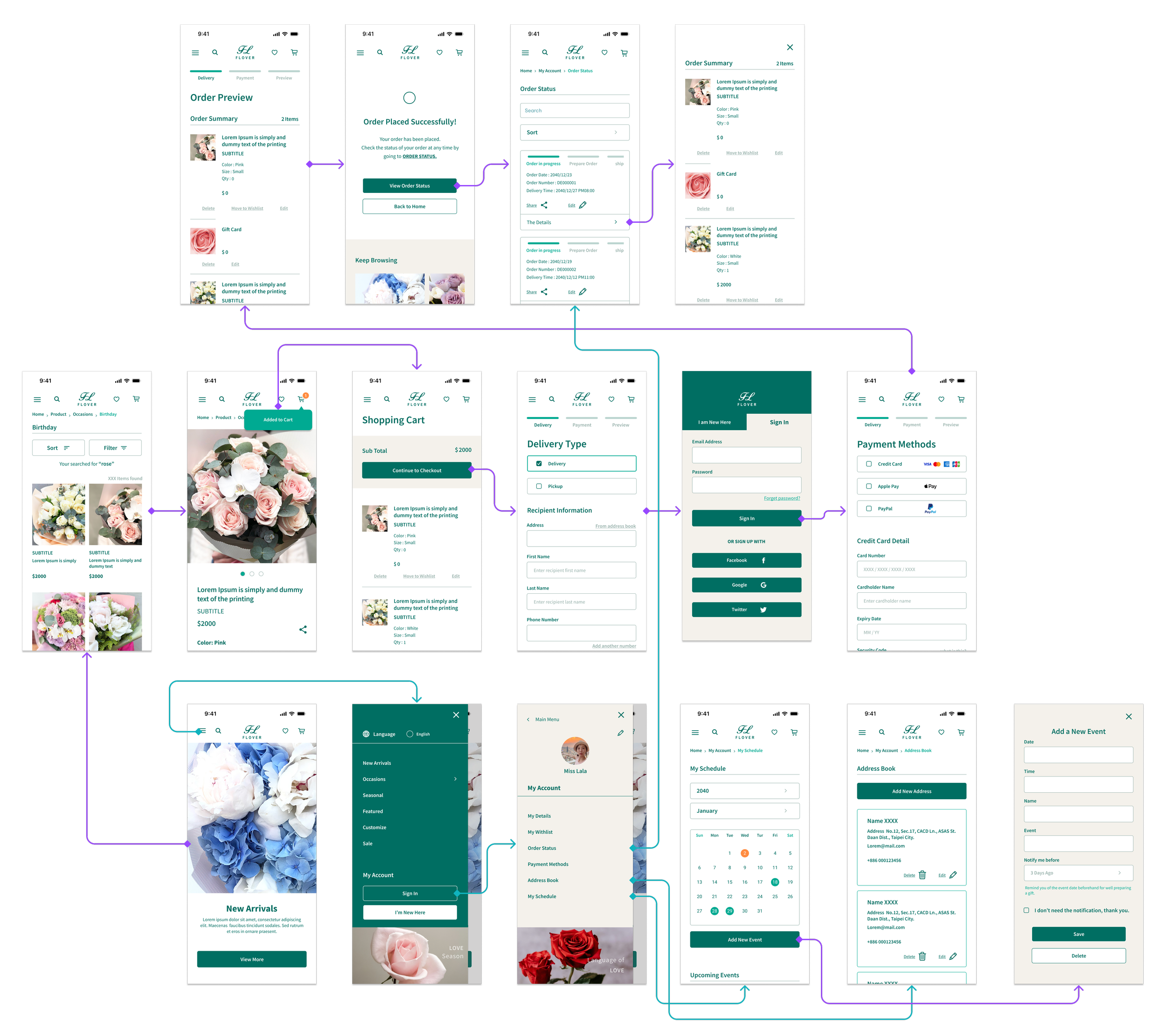
Here we go!
Home Screen
Beyone the Usability Study
The usability study helped identify friction points in navigation, comprehension, and task completion. Mainly optimized how users interacted with the interface—not why they came to the service in the first place.
The real challenge was not just making the interface easier to use, but aligning the product experience with users’ real-world contexts.

New questions raised
Redefine Problems
Most shoppers come with a specific goal
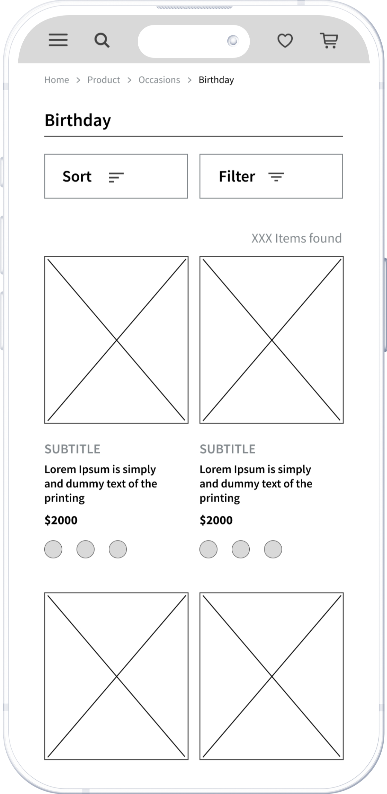
The original homepage emphasized themed product categories, encouraging users to explore based on visual interest. After observing user behavior more closely, I found most shoppers come with a specific goal. Rather than removing product discovery entirely, the challenge became how to prioritize precision without losing inspiration.
Gifting decisions are strongly driven by time
Initially, the calendar feature was designed as a reminder tool. Most gifting actions are triggered by upcoming important dates. If gifting decisions are strongly driven by time, the calendar interface had to surface not only what was coming up, but also what action to take next.
Experience-Level Design Decision
-
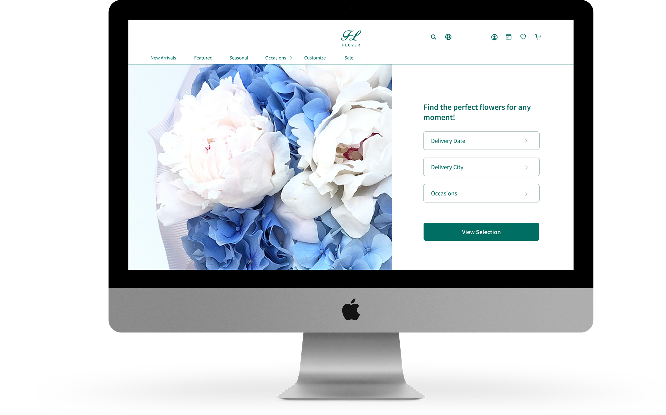
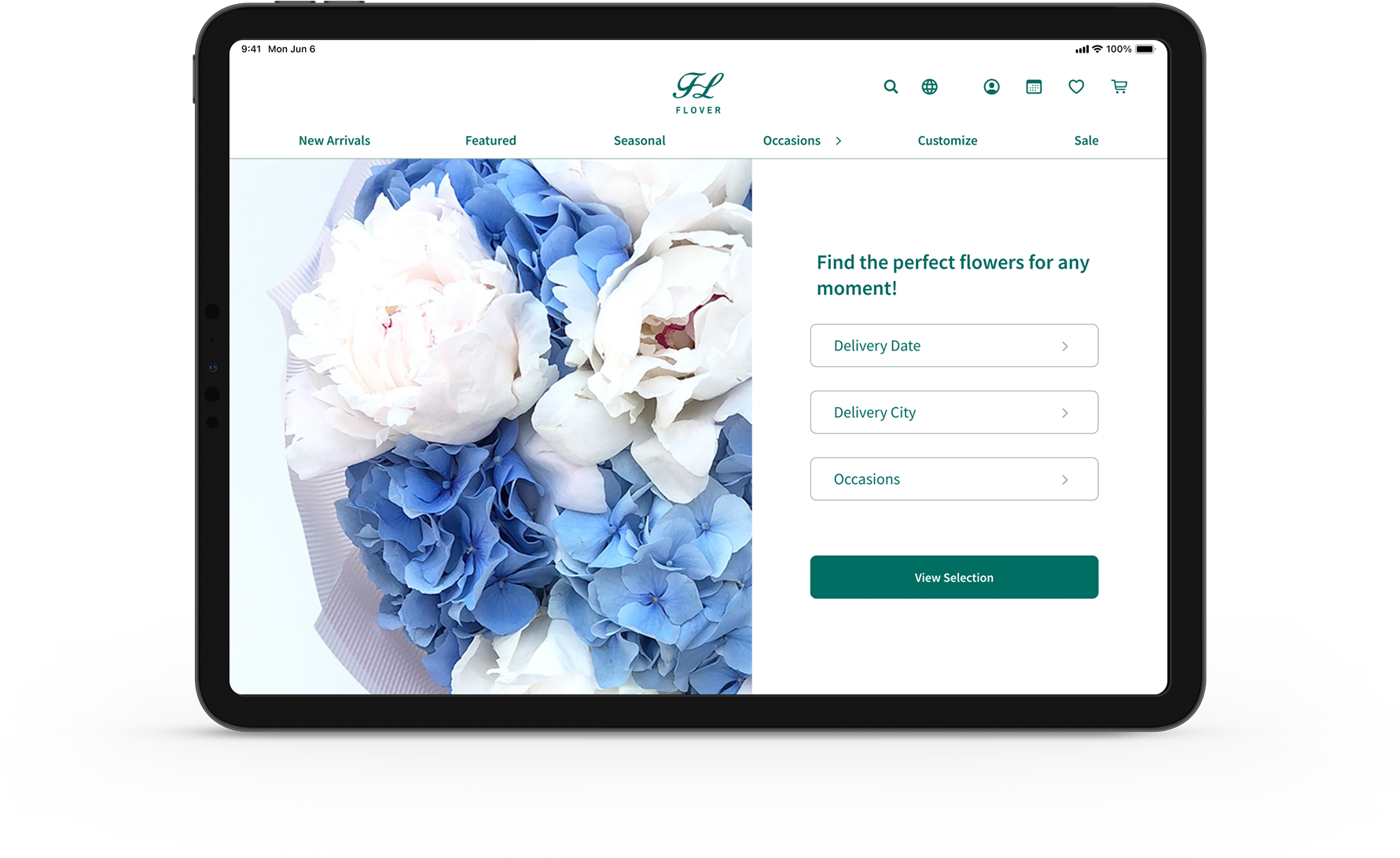
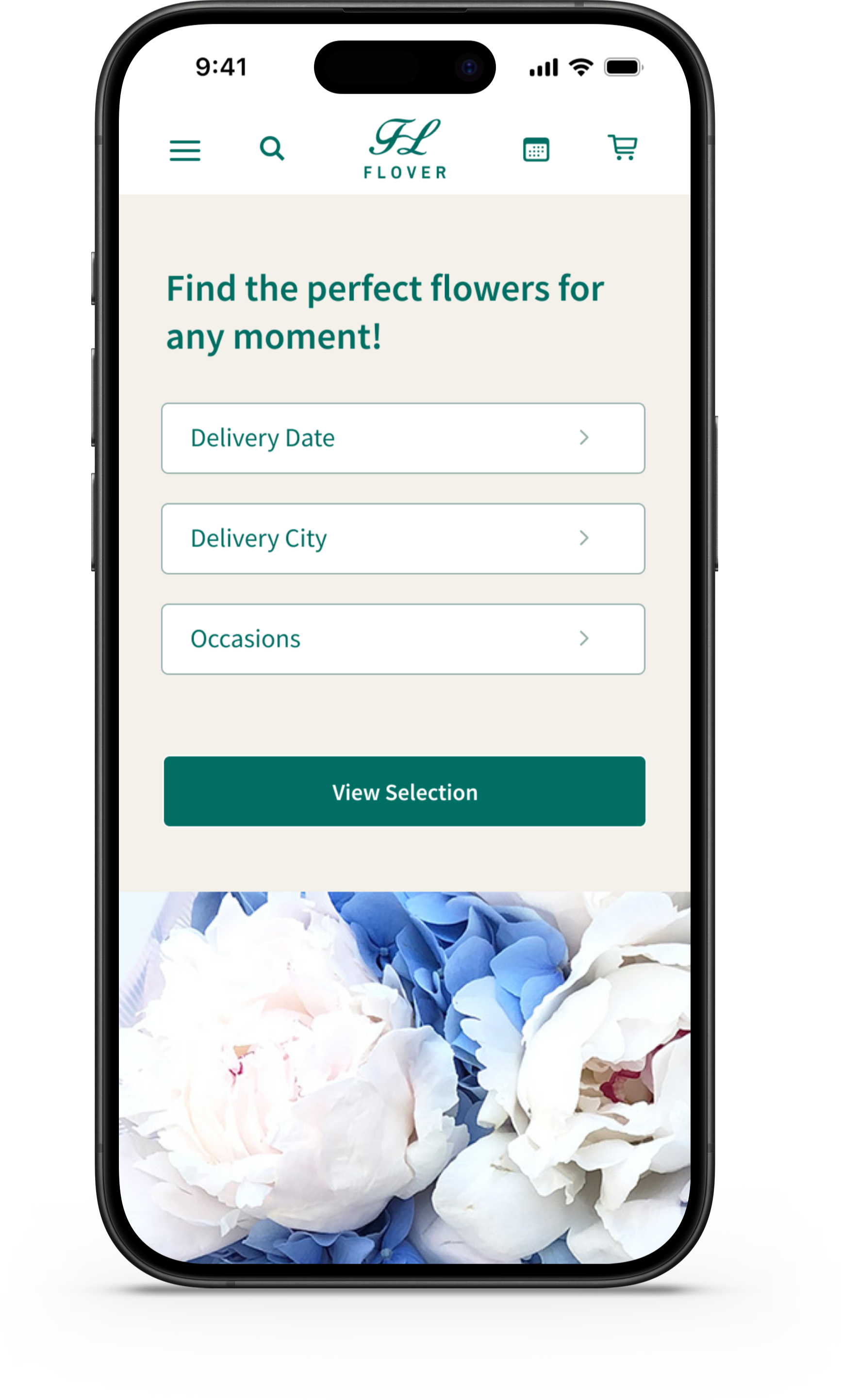
Context-First Homepage
I restructured the homepage to feature a search bar as the primary entry point. Search results present relevant products that match the selected context, helping users move directly into decision-making.
Product categories and themed collections remain available in secondary sections below the fold, supporting inspiration-driven browsing without blocking goal-oriented users.
-
Calendar-Driven Experience
I deepened the integration between the calendar and the purchasing
experience, turned reminders into actionable purchase moments. When users tap a push notification, they are taken directly to a dedicated landing page tailored to the specific occasion and delivery date. This minimizes re-searching and context switching.Calendar events were redesigned as actionable cards that combine recommended products and direct links to dedicated landing pages. This allows users to browse and purchase directly from recommendations without starting a new search.
User Flow
Browsing / Checkout / Add a new event
The updated flow allows users to enter through contextual search or calendar reminders, leading directly to curated product results and checkout. This approach reduces unnecessary browsing and creates a more efficient path to purchase.

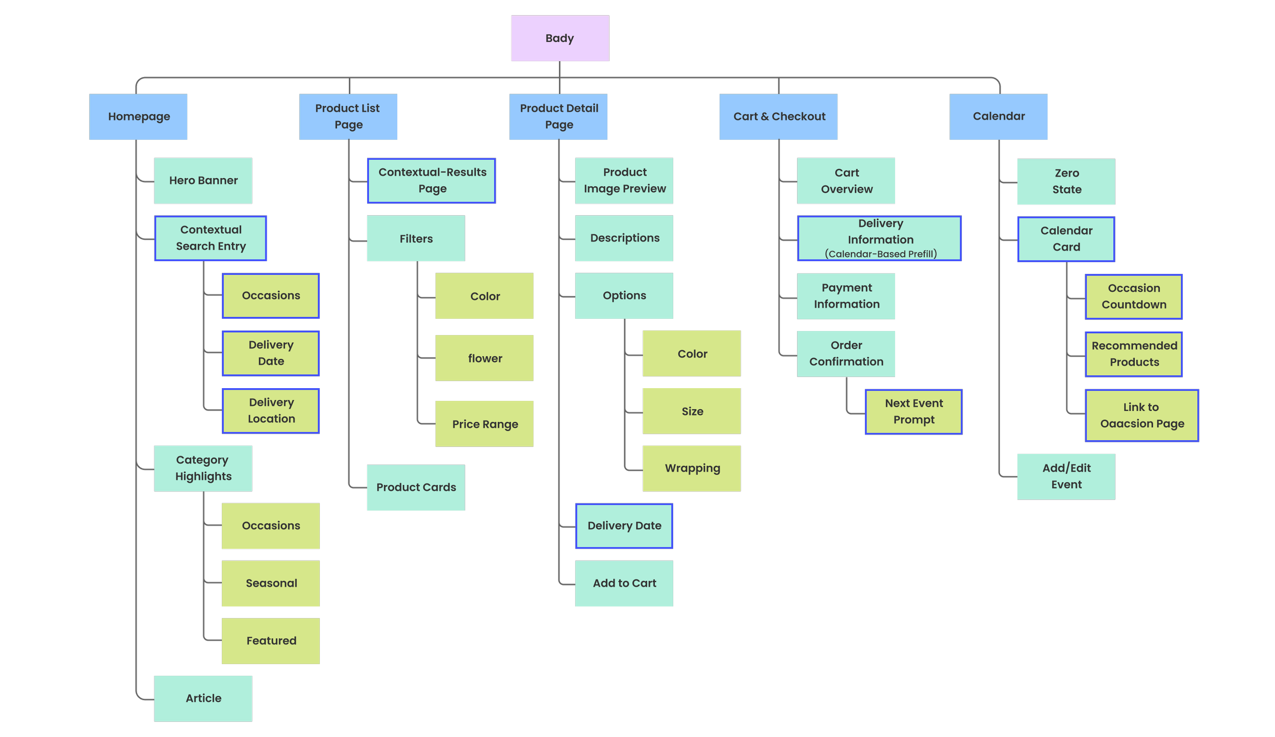
Sitemap
The highlighted sections indicate newly added or restructured areas in the second phase. In the refined sitemap, search became the primary entry point, allowing users to express intent upfront through occasion, delivery date, and location. While calendar cards introduce upcoming events directly link to curated product pages and checkout. These additions reorganized the body structure to support faster, goal-driven navigation.

Hi Fidelity Prototype
Context-First Navigation
The homepage search is optimized for specific gifting occasions, arrival times, and locations to provide precise results instantly.
This approach reduced time spent browsing irrelevant products, helped users reach purchase-ready options faster. It supported both goal-driven and exploration-driven behavior and created a clearer priority.
Zero State & First Action
A dedicated zero-state screen is introduced when no events exist. This screen highlights the core benefits of the feature—time-based reminders.
Calendar-Driven Gifting Experience
Users are guided by their personal schedule. Clicking a notification leads to a contextual landing page that locks the occasion and recipient, pre-filtering the best options to save decision-making time.
Checkout forms automatically import recipient and address information from the user’s calendar, reducing repetitive input
After checkout, the experience surfaces the next upcoming event, offering users the option to plan ahead and pre-select gifts in advance.
Instant Specs Preview
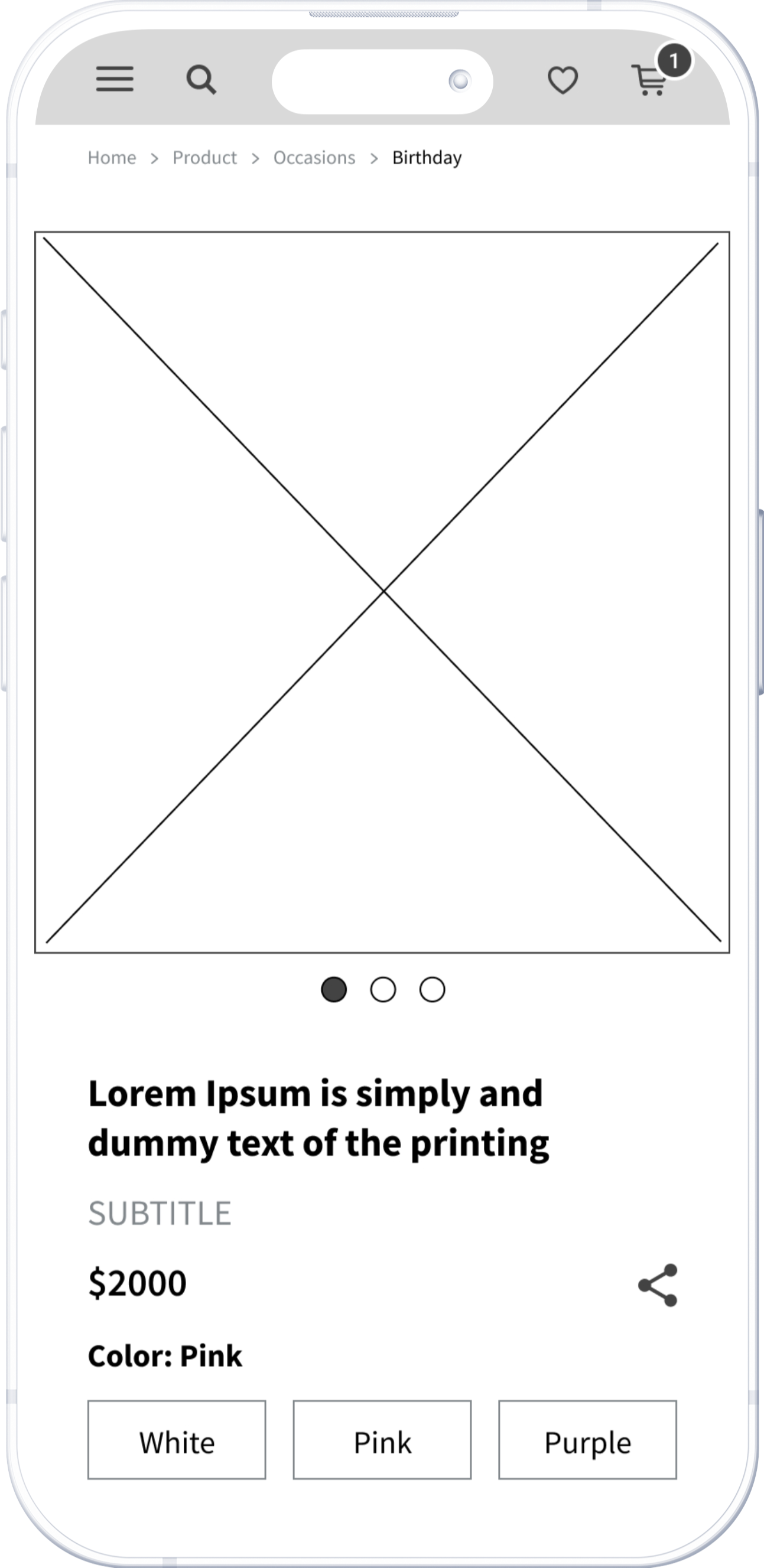
Users can preview different sizes, colors, and packaging levels within a single view to eliminate uncertainty about the final product's appearance.
Implementation of waterfall-style product extensions enable uninterrupted exploration, creating a more immersive browsing experience.

Closing Thoughts
Takeaways
This project began with a basic e-commerce website. As the design progressed, it became clear that improving usability alone was not enough to address the real challenges of flower gifting.
By stepping back from individual screens and focusing on the overall service experience, I re-examined user motivations and reframed the problem around context, timing, and intent.
This shift led to adjustments in information architecture, a more precise homepage entry strategy, and deeper integration between reminders and purchasing flows.
I learned how to create a proactive ecosystem that feels like an intuitive assistant rather than just a digital storefront. It showed me that polished UI is only the foundation, the real value lies in the strategy behind the service.
Since this is a course project, I believe there's still more work to be done for the real-world users.
Next Steps
- Multi-Recipient Checkout
Design a checkout flow that allows users to handle
complex orders where a single user sends different
products to multiple locations and recipients in a single
transaction.
- Smart Reminder Content
Extend reminders by dynamically adjusting
message tone and calls-to-action based on event
proximity, guiding users from early inspiration to timely
purchase decisions.
- Personalized Recommendation
Further refine recommendation rules based on user
behavior, purchase history to surface more relevant
products with less manual filtering.